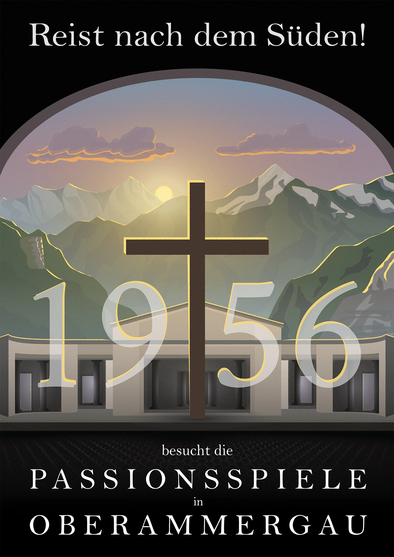
This was a project I did for fun and as a favor for the stage design of a theater performance of Friedrich Dürrenmatts „Der Besuch der alten Dame“.
The requirements were only to incorporate this specific wording and for it to advertise the Passion Play in Oberammergau. This is a huge event on Europes biggest open air stage, that’s only put on every 10 years, in which they recreate the events of the biblical easter passion. Because of the very long 10 year frequency the actual advertising usually focusses heavily on the year it’s taking place. Therefore I had the idea to incorporate an easteregg to the premiere of Dürrenmatts play, which took place in the year 1956.
This rendition of the play isn’t tied to a certain time, and only has some vague fifties elements, so I wanted to orient myself on illustration from the fifties, but give it a slight modern spin. First I set out to create a moodboard to communicate my goal for this project, as well as setting myself a guide what I’d be aiming for.
Conception
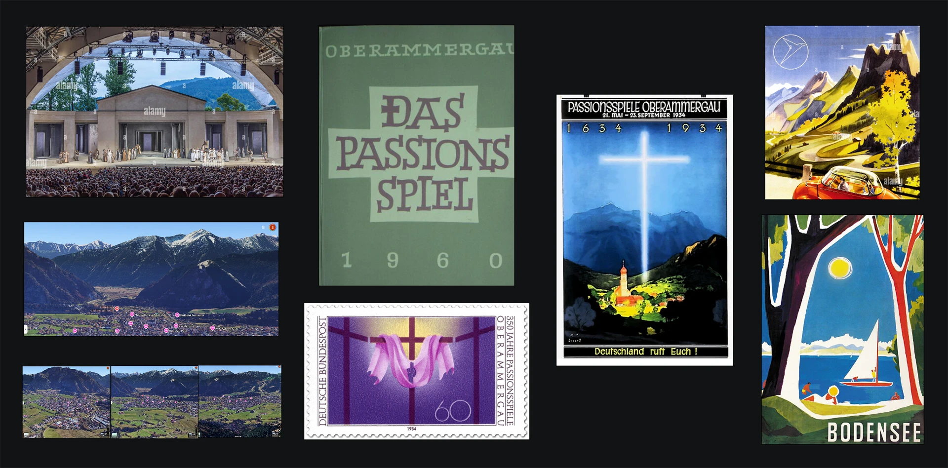
This was the moodboard I landed on. First I had photographs of the actual stage as well as the surroundings of Oberammergau from google maps. Then actual illustrations from the Passion Play in 1960 as well as 1934, and finally some more general illustrations from the time.
A few things I picked out were:
- a cross being the central and most noticable element
- the cross is connected to and highlighted by a glow
- the location and mountain setting as an important element
The green 1960 poster was a bit too funky for my taste and I was aiming for something more serious, but I really liked the stamp and I was aiming for that kind of cross and highlight, as well as the typography with its wide spacing of „Oberammergau“.
The 1934 poster is noticably rooted deep in its time, featuring the nationalistic slogan „Germany calls You!“ paired with the focus on the landscape, with the glowing cross illuminating the whole village and serving as a beacon and ward against the very dark surrounding the village. Despite the problematic tendencies it is a very effective and emotional illustration reflective of the propaganda of its time. I liked the focus on the mountains from the bird perspective and the larger than life cross, as well as the implementation of the architecture, but I wanted to focus on the stage rather than the church.
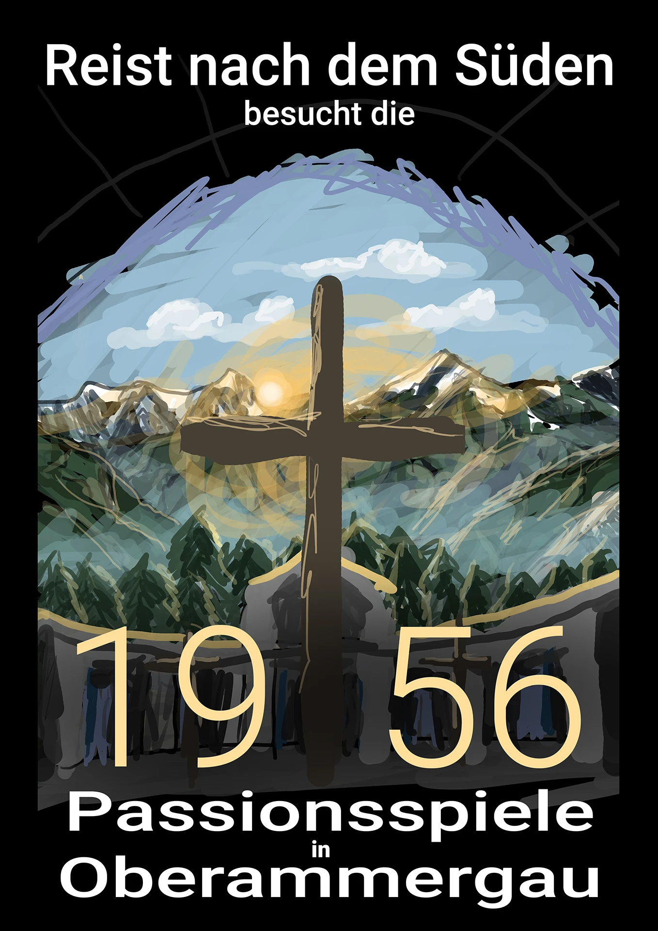
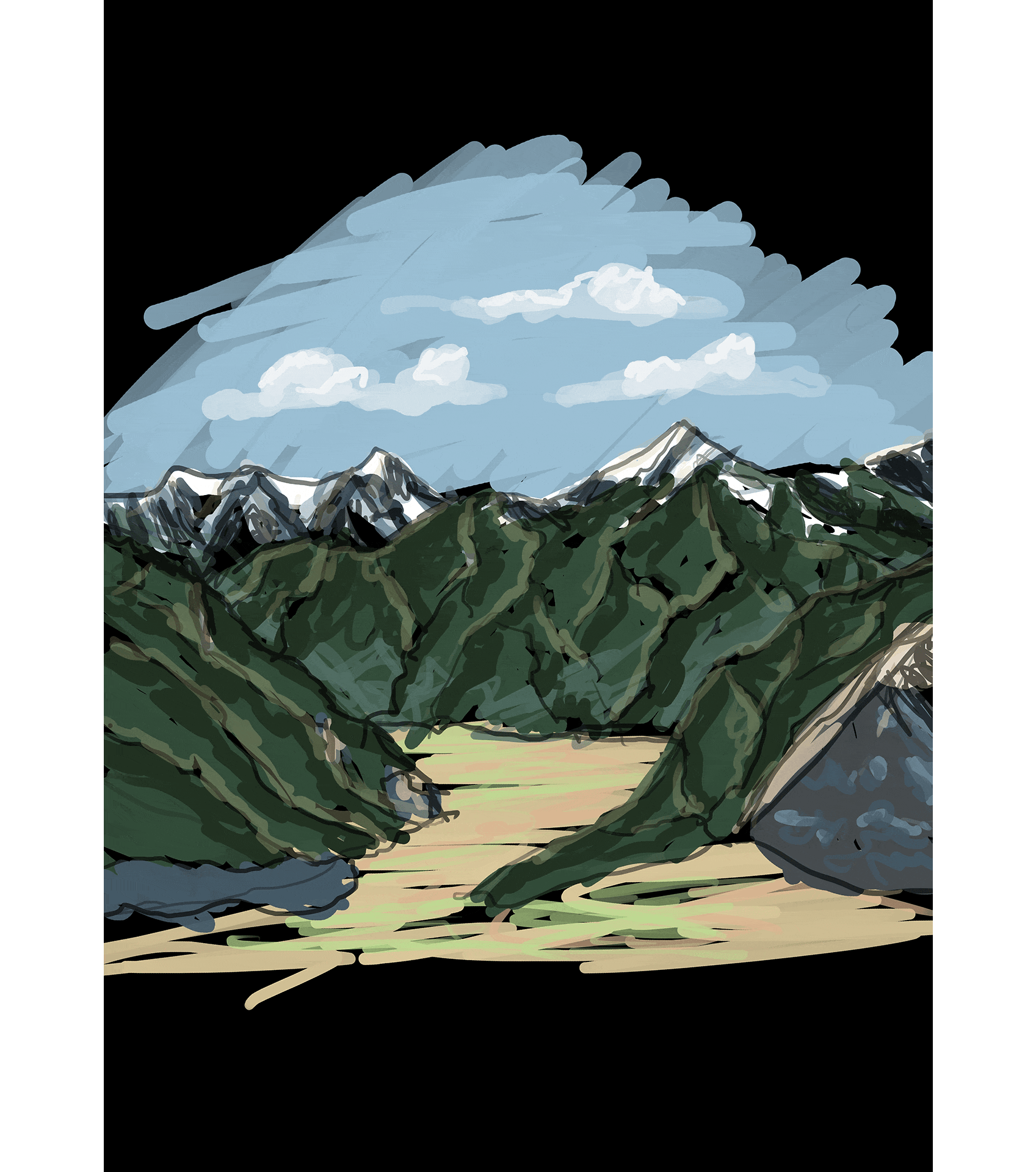
This was a rough concept drawing I drew to visualize the ideas I wanted to implement from the moods I picked, centering the cross and framing it with the stage, while having it backlit with warm sunlight symbolizing the hope of easter, against a backdrop of the mountains around Oberammergau. I had to cover a bit for the perspective here, therefore I added trees as an additional middle element. I also added the text, trying to keep the specific wording while optimizing for the main messages.
Vector Graphics
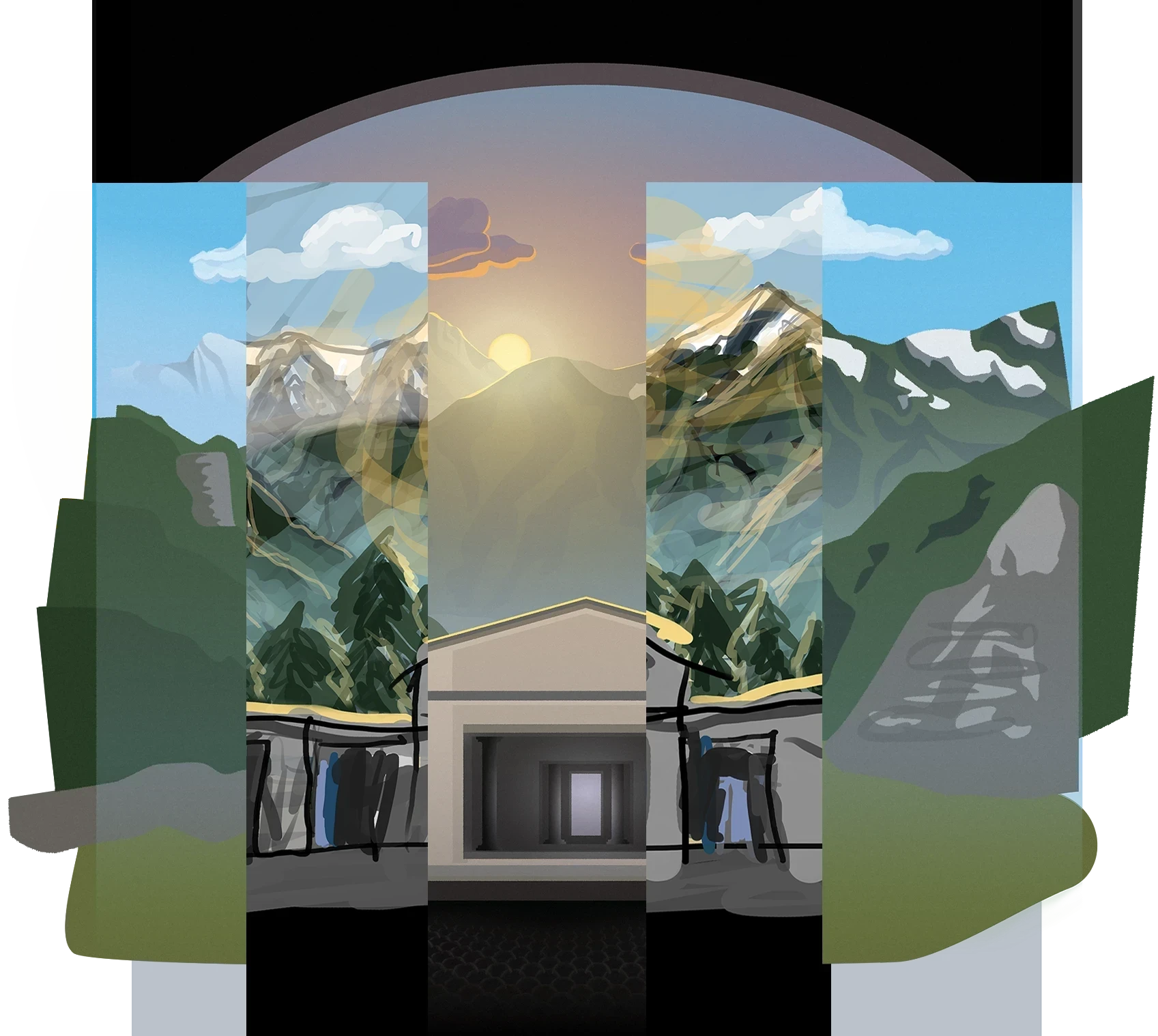
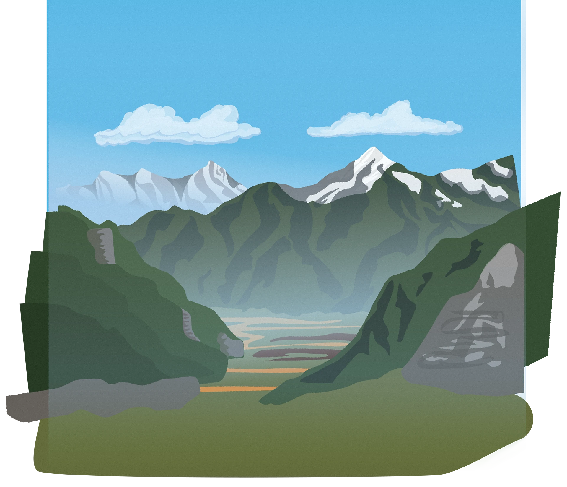
This concept was recieved so well that my friend wanted to use it as the actual poster already, but I was far from done. I started creating vector graphics in Illustrator from the concepts and focused on simplistic visuals, breaking the shapes down in base color, light and shadow. To create additional atmosphere, perspective and realism I also addet gradients from light blue to transparent, to create the effect of haze hanging in the valleys and getting more the farther something is located from the viewer.
Since I originally drew the concept mid day and a bit cloudy and added the sun quite late, I ended up creating something similar at first, though it wasn’t hard to adapt that to sunrise lighting. For that I added a pink to blue gradient often seen in sunrises into the background, adapted the color of the clouds to make them look like being illuminated by the rising sun.
I made a sun and placed it between the two mountain ranges. Then I went ahead and drew additional shapes over the edges where the sun would hit that, making them wider the more vertical they were and thinner the more hoizontal they got. For Light hitting rocks I drew them sharp and jagged, to hint at the different material.
To give them an illuminated look I placed a deep purple translucent plane underneath the sunlit edges, to darken everything not being hit by the sun, while adapting the color towards the indirect lighting of the newly pink-ish sky.
Stage and Cross
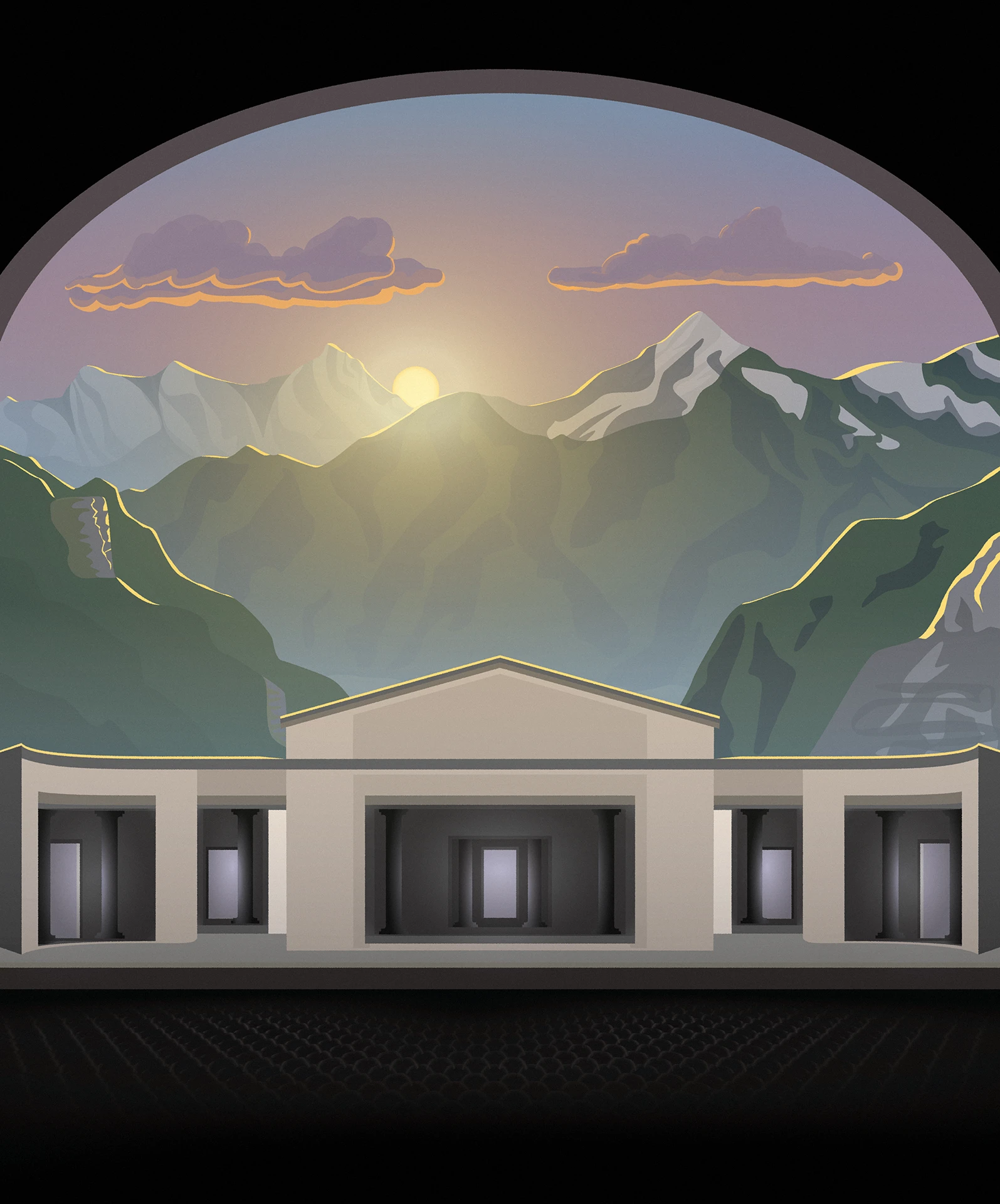
Then I drew the stage construction from the photo reference, but adapted towards a perfectly frontal perspective. I used radial gradients to light the insides from the doors, as well as the columns beneath them. Also I added a sunlit edge to the top of the building. Beyond the stage I developed a pattern of half circles as seats, which I then distorted to create perspective.
Finally I added the cross, with an additional yellow radial gradient from the sun to set the point of highest contrast right on the top of the cross, to draw immediate attention to it, together with the mountain edges, framing it, as well as leading the eyes towards the cross, also I added a bit diffuse shadow to actually root the cross on the stage.
Photoshop and Typography
I then exported it to Photoshop, to add a bit grain, as well as the typography. For the main text I chose the Bell MT Regular Typeface for its timelessness and elegance. It also fit my vision of aiming towards the typography on the stamp. While being an amazing font for the main text, its numbers were too slanted and its stroke width too inconsistent to fit the more geometric look of the stage. Therefore I chose to display the year in Google Fonts Crimson Typeface for its similar yet toned down look. To tie it in with the illustration I reduced the opacity and added sunlit edges as well.
Critique
All in all, I’m very happy how the poster turned out, as was my friend. As a small critique I’d raise that it overall still has a rather modern look, probably owed to its vector-graphic look, the transparency in the year and the placement of the bottom text on top of the seats instead of a separated area. Another element that bothers me a little is that the cross is covering the central door a bit weirdly, with the lit columns bordering right on the cross without its light source being visible, maybe it would’ve been better to remove the inner chamber and reduce it to just the main columns, or filling the whole frame of the inner chamber like it was a lit door to boost the contrast the stem of the cross.
Finally below you can check out a making of animation, to get more insight into how the layers are structured:
Making Of